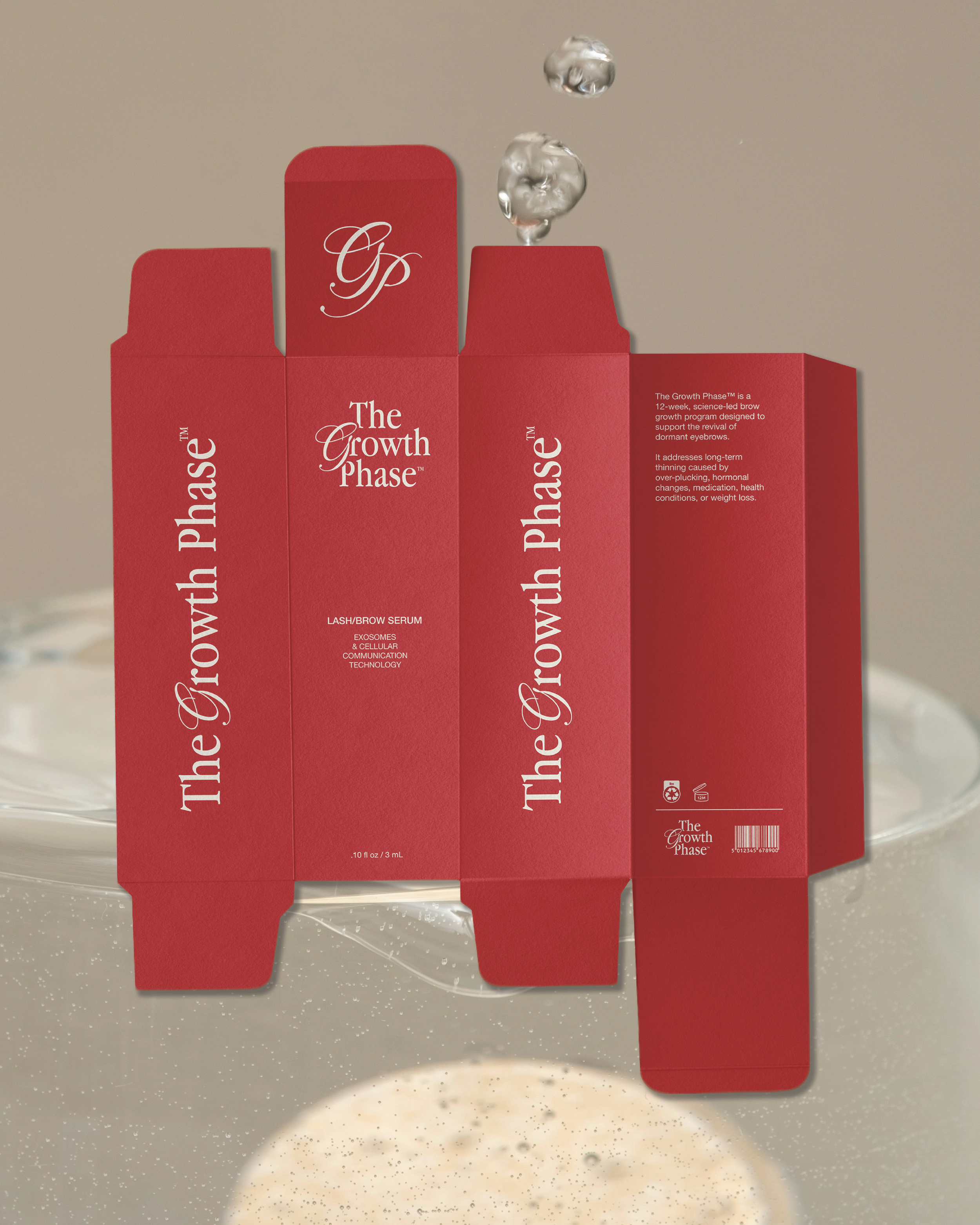
The Growth Phase
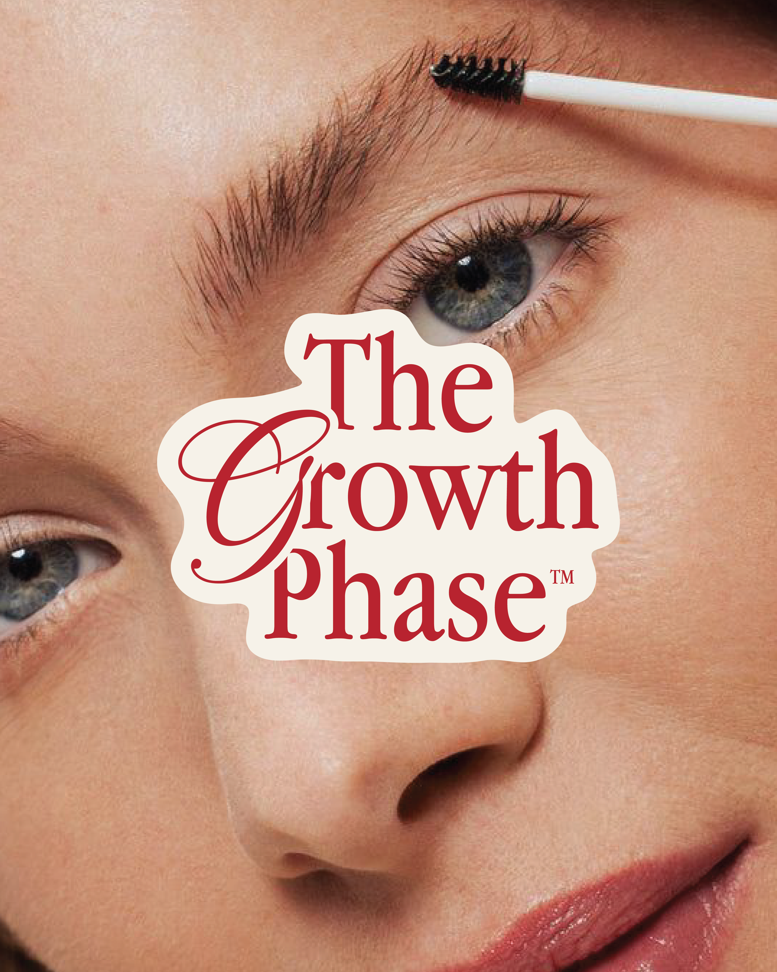
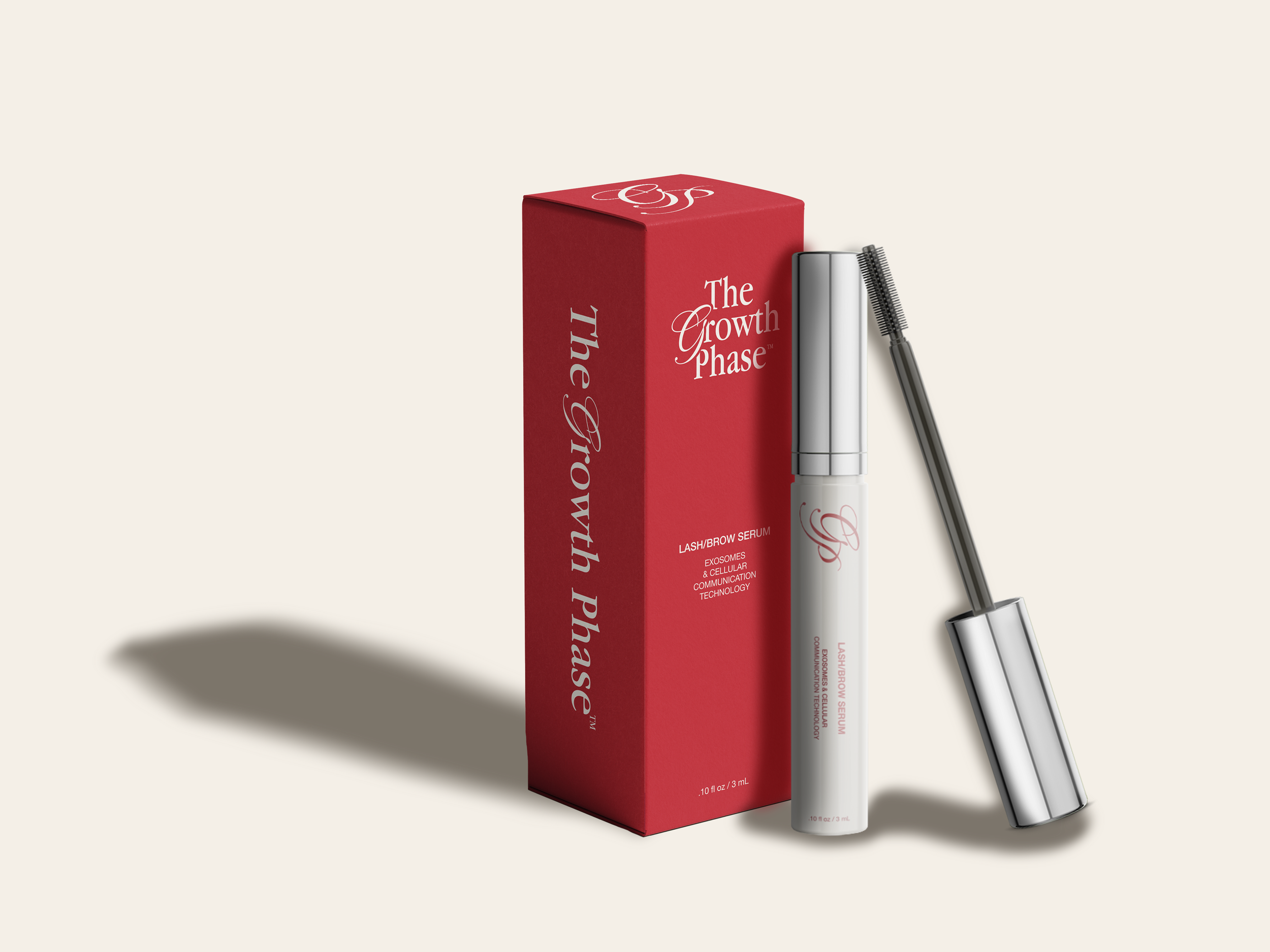
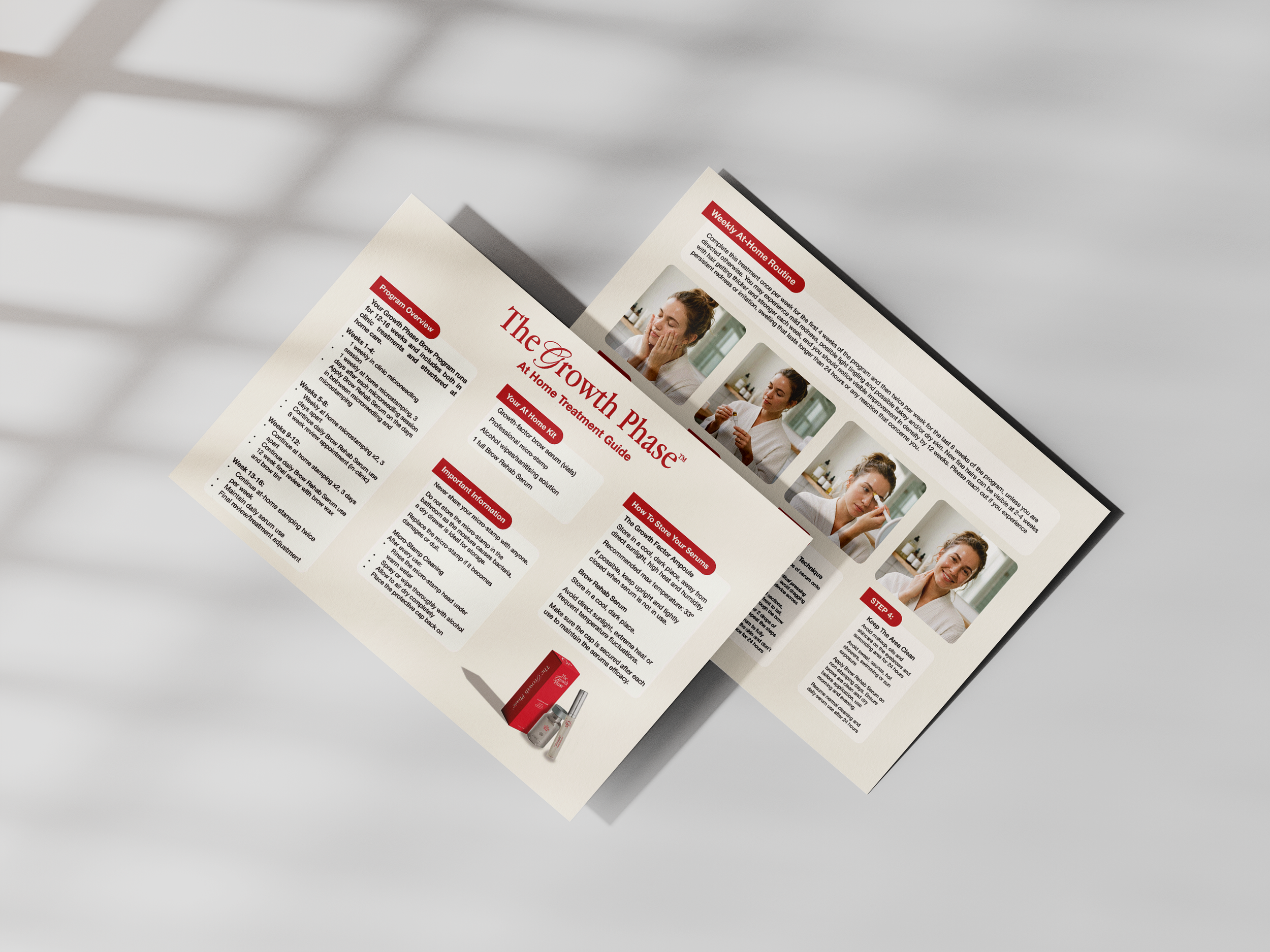
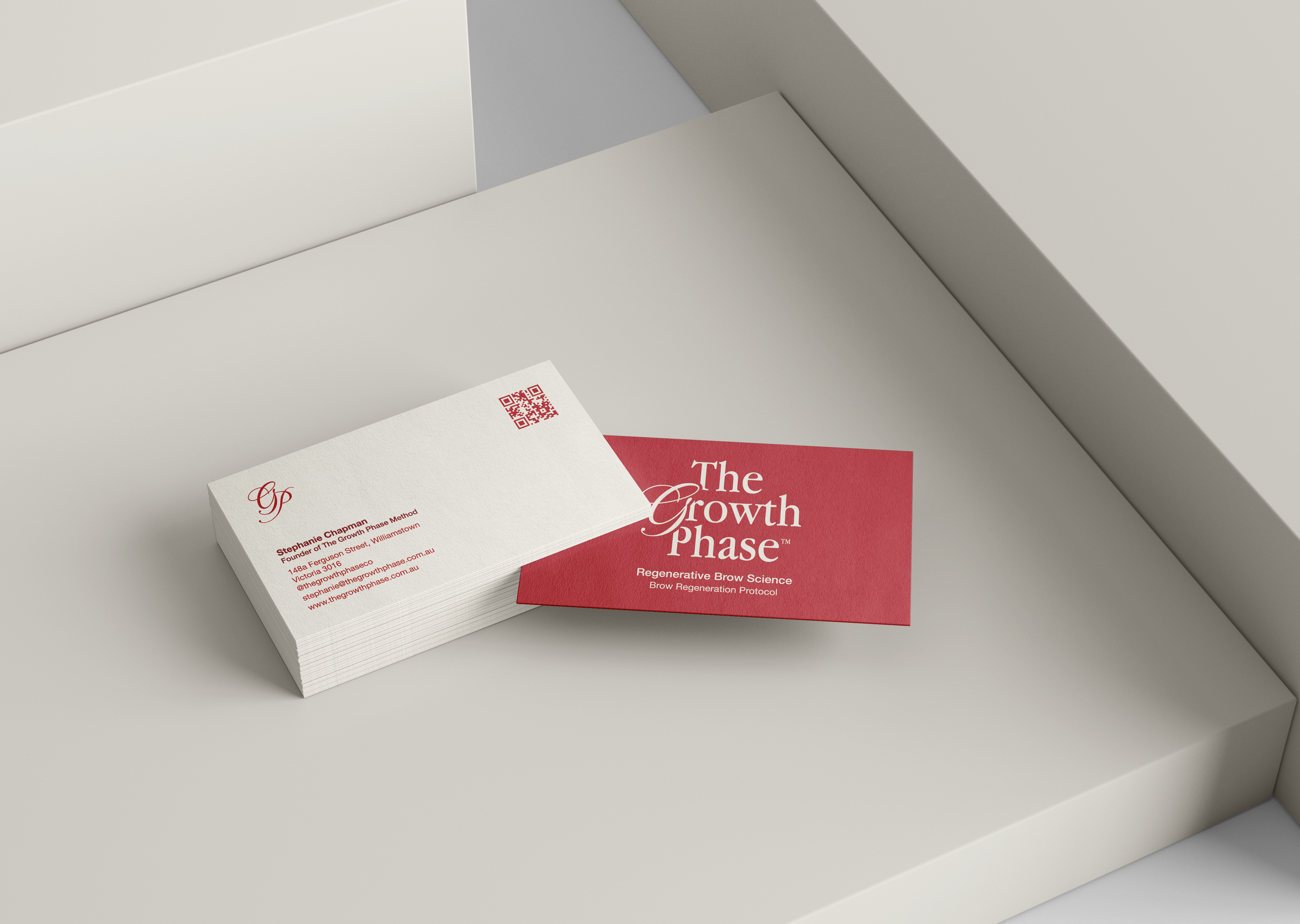
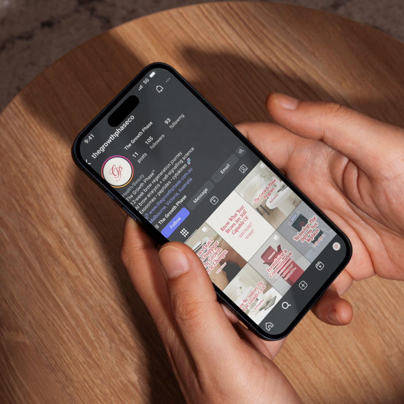
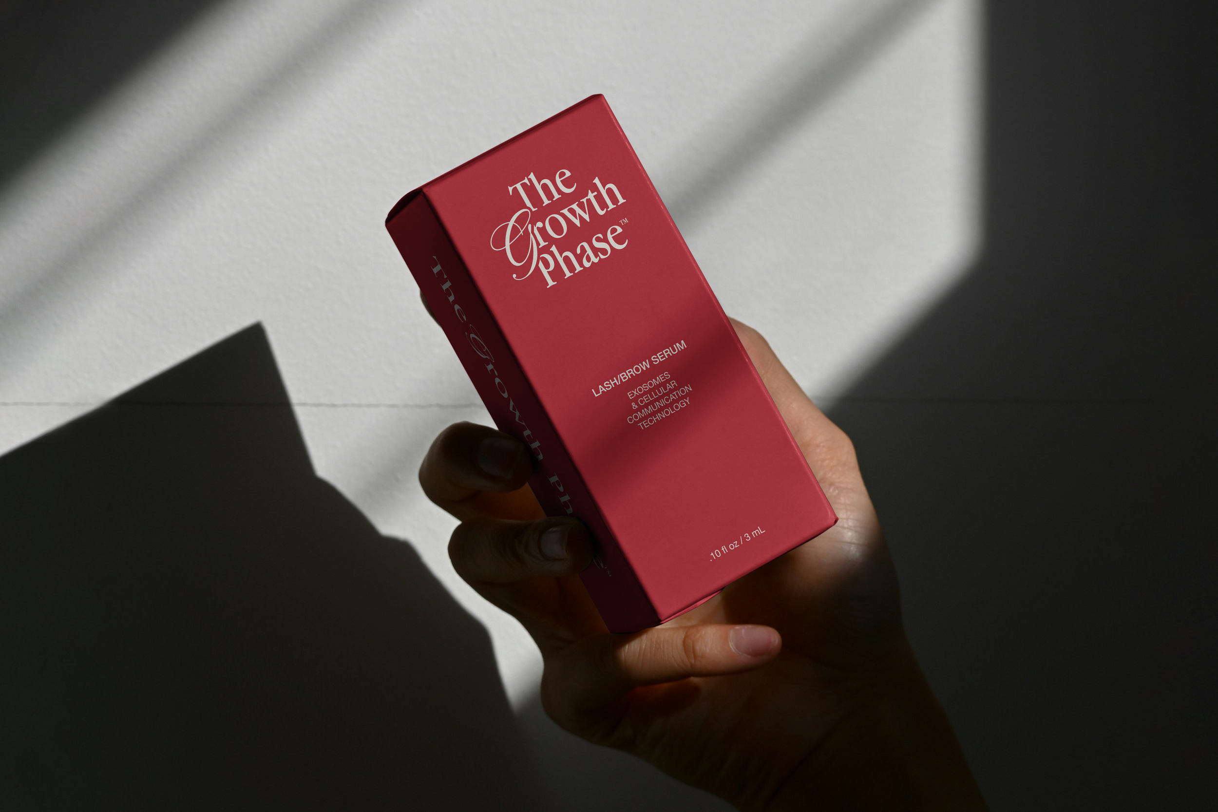
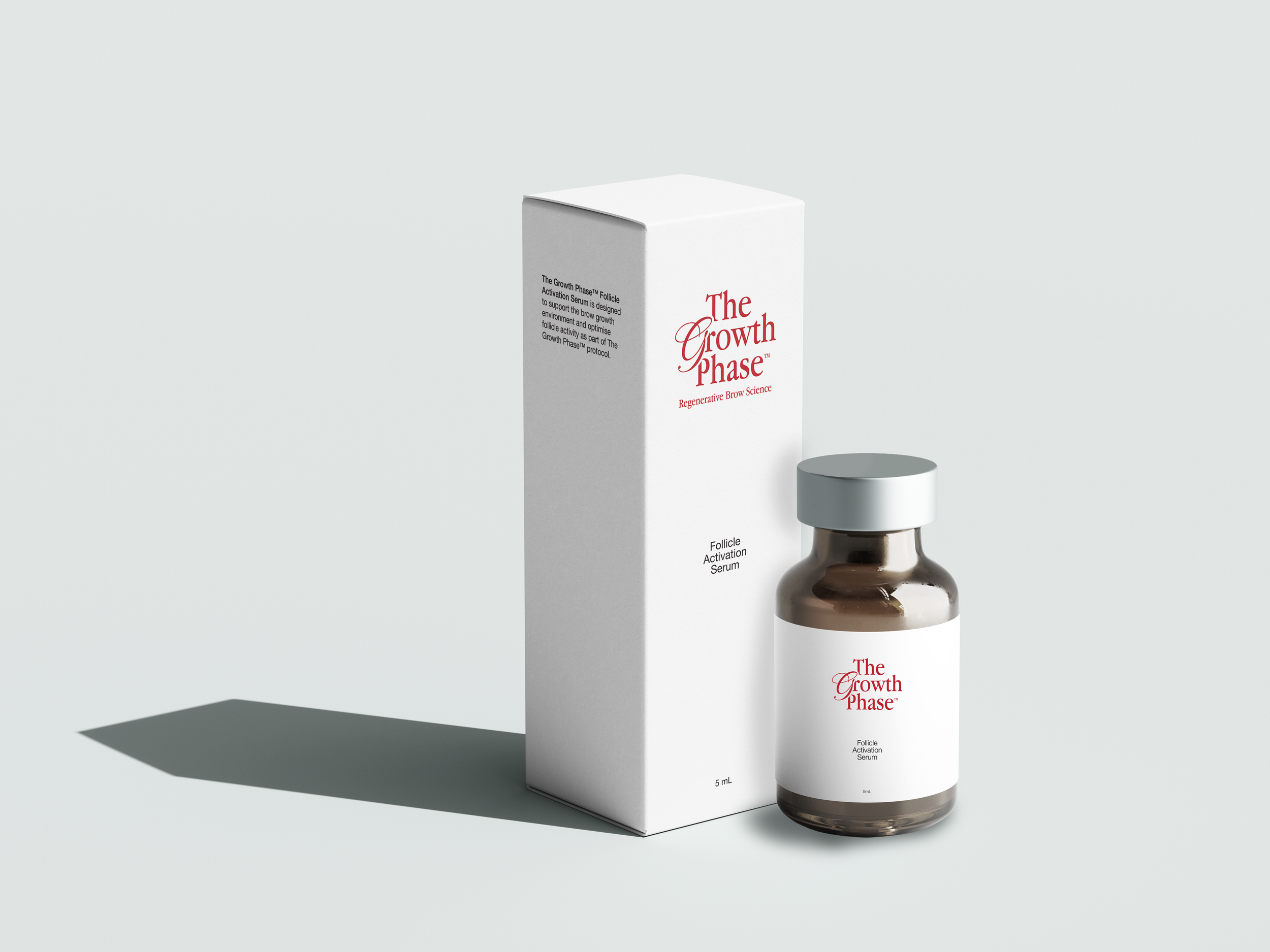
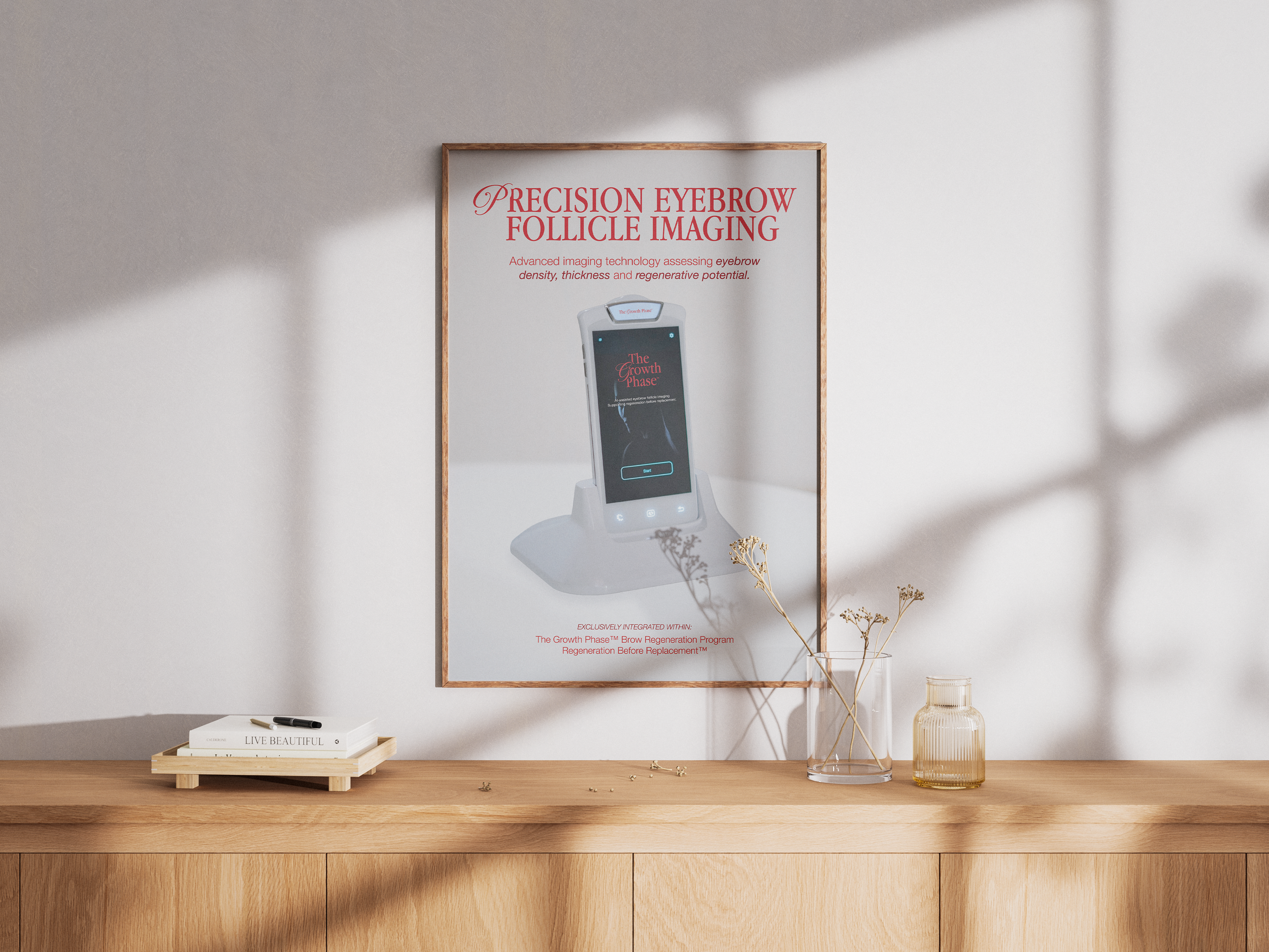
The Growth Phase™ is a 12 week, science led brow growth program designed to support the revival of dormant eyebrows. For this brief the client wanted the new brand identity to be clinical and high end yet still attractive and approachable for the clientele. I was given the pre-existing logo design, typography and colour palette as a base for what the client wanted the overall brand identity to look/feel like. The three logo variants grated for The Growth Phase consist of a classic serif font paired with a smooth, flowy cursive font which communicates the high end, clinical tone of the brand without feeling flat or lifeless. Alongside the brand refresh, The Growth Phase needed a multitude of assets to support the brand launch such as packaging design, social media design and multiple print design pieces. The brief for these assets were similar to the original brief; clinical, professional, high end but with an educational spin. To achieve this desired aesthetic, voice and tone I combined all the brand elements into clean, minimalistic compositions that effectively convey all the information necessary for consumers whilst also having high levels of hierarchy, visual cohesion and brand recognition.